Two iPhones suspended in the air with the myFrontier app open

Frontier Communications

The ask

Frontier Communications is an internet service provider delivering a range of connectivity options that compete with nationwide fiber optic providers such as Verizon FiOS.

Recovering from a tumultuous period — kicked off by the COVID pandemic — Frontier leadership was eager to rejuvenate their brand and elevate their subscriber experience.

My team pitched and won an initial scope of work to redesign Frontier’s web site, a successful effort that established Razorfish as digital agency-of-record.

Subsequently, we overhauled the company’s MyFrontier app supporting Frontier’s subscribers.

Deliveries

  • Product and experience research
  • User Journeys
  • Product & experience strategy
  • Responsive Web Design
  • Mobile App

Client

Frontier Communications

Area

Responsive Web
Mobile App

My Role

ECD, Experience Design (SVP)

Date

2022 – 2023

Responsive Web Site

Updated brand. What does that mean for customers? UX had the answer

With its comeback, Frontier wanted lean heavily into being the challenger and innovator ISP. 

However, Frontier’s first challenge would be to rehabilitate a tarnished customer experience. ISPs have consistently low customer satisfaction, and at the time, even Frontier’s satisfaction scores indexed well below industry averages.

Frontier had come to Razorfish with an updated brand near final, but were not confident how they could utilize their brand to capture new customers and keep existing customers from jumping ship.

Our solution? Consistent with UX principles, one of the most important messaging and service principles we advocate for is transparency, simplicity and empathy. Consumers are educated and have all the resources necessary to make informed decisions.

Our first problem was to get new customers to look past a potentially poor first impression and get excited about the company’s new offerings:

Icon of an open book

Educate, then Convert

We identified that Frontier’s existing site pushed for conversion far too early within the user journey. We needed to create opportunities for them to pull potential customers in to a conversion funnel, creating enough intrigue to seriously consider connecting with Frontier.

Icon of an open palm holding up a portrait of person

Engage audience
specific messaging

We couldn’t speak to general audiences the way national competitors, such as Verizon FiOS easily can.

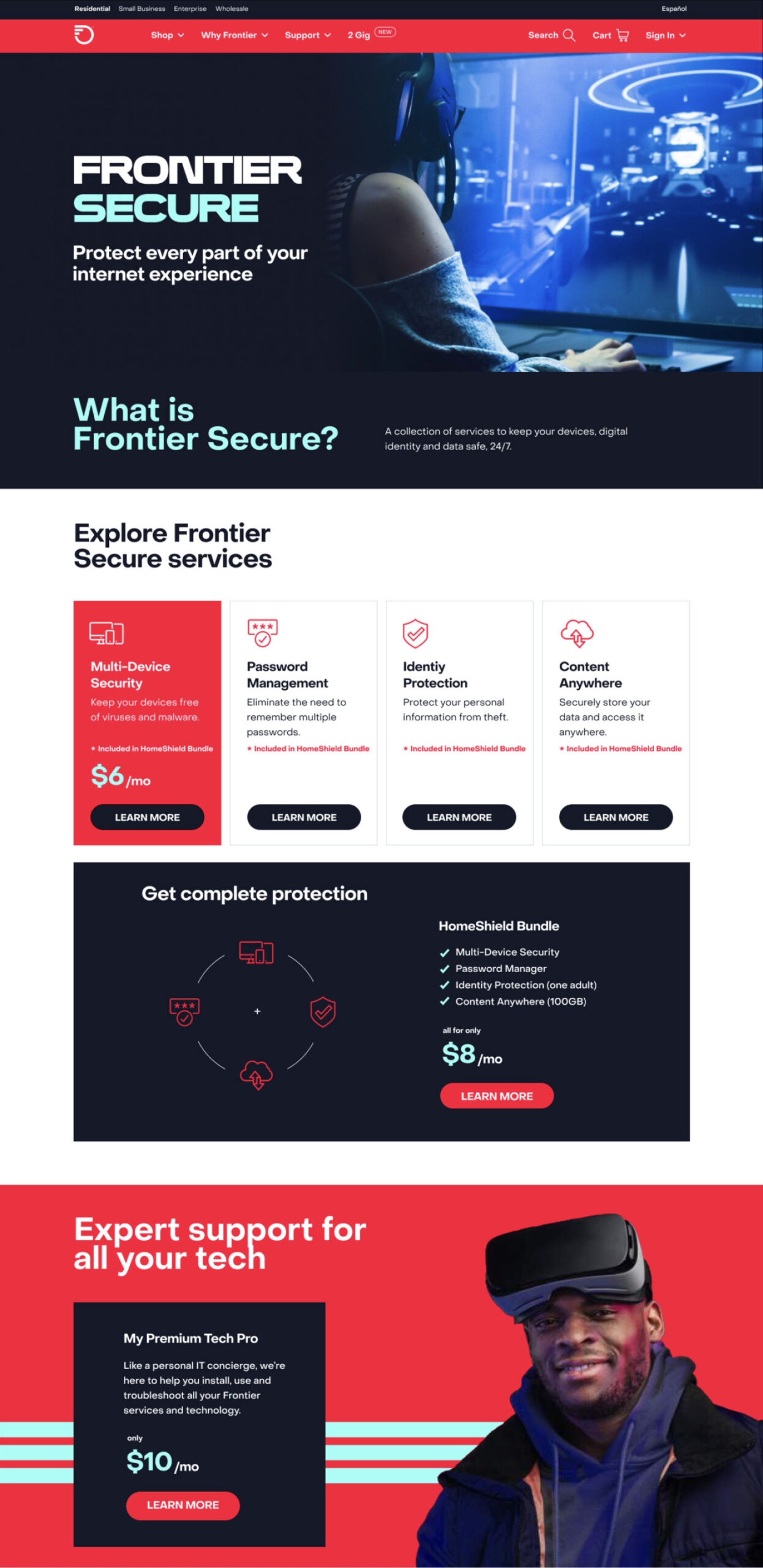
Identifying smaller target audiences for conversion that could be won over by their product offerings would give Frontier the ability to play more impactful direct messaging.

Icon of a group of people collectively excited about the a growing plant

Stand up the
post-conversion journey

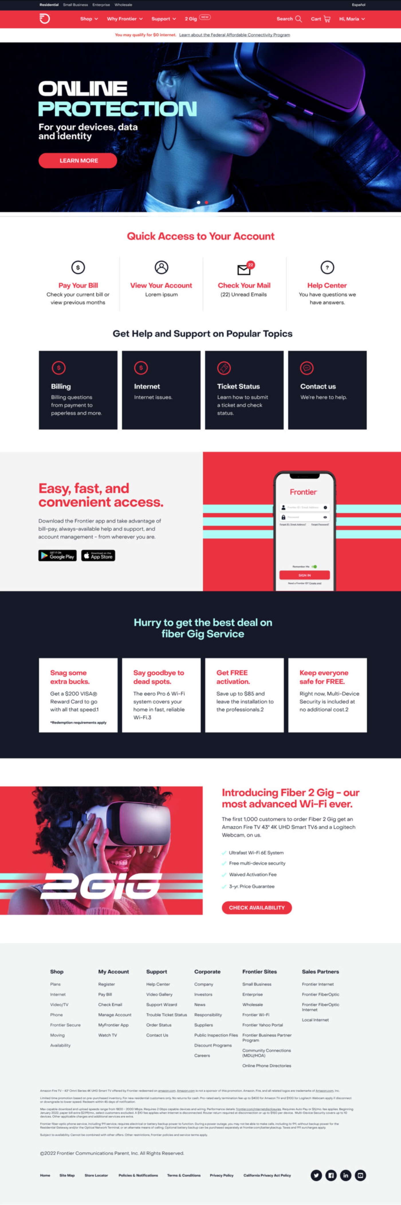
One of Frontier’s previous weaknesses was delivering adequate customer support once a customer converted to a subscriber.

We wanted to make sure Frontier was committed to honoring a retention journey and this started with the Web site providing, direct easy access to support.

Later, we converted the retention journey into a larger win with the MyFrontier app.

User Journey

Delivering UX artefacts out of discovery and strategy, we were able to provide 3 distinct user journeys
and a web architecture that set the foundation for future growth.

A multi stage user journey for Frontier Communications

User Journey

One of three primary conversion audiences

Information architecture (sitemap) of the Frontier Communications website.

Information Architecture

A simple foundation that has an extensible future

    UI & Visual

    With the final creative delivery, we’re able to see the new brand, UX and messaging in action.

    A desktop and mobile design of the Frontier Communications homepage
    A desktop and mobile design of a Frontier Communications web page for their Help Center
    App Solution

    Standing up a bespoke retention platform exclusive to subscribers

    The web work demonstrated how effective a partner my team was in standing up an impactful customer experience. We were awarded the opportunity to overhaul Frontier’s customer retention app.

    MyFrontier existed as an oft-forgotten part of the brand’s digital and customer retention experience.

    Through the strategy and web work, we painted a clear picture that recuperating the brand needed to go much further than winning new customers. Celebrating existing customers and giving them the support they needed, on demand, could be easily achieved through a better mobile touchpoint.

    A row of 3 screens of the MyFrontier app
    A row 3 screens of the MyFrontier mobile app