Wellington
Management
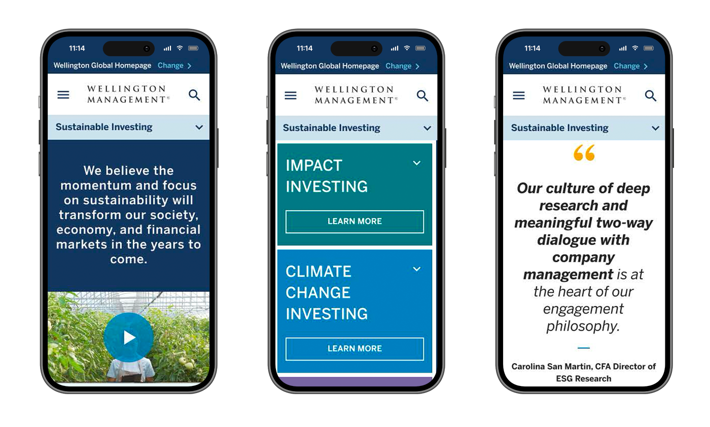
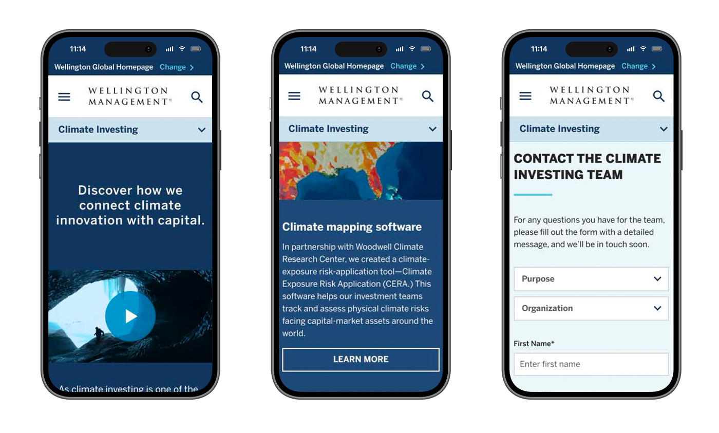
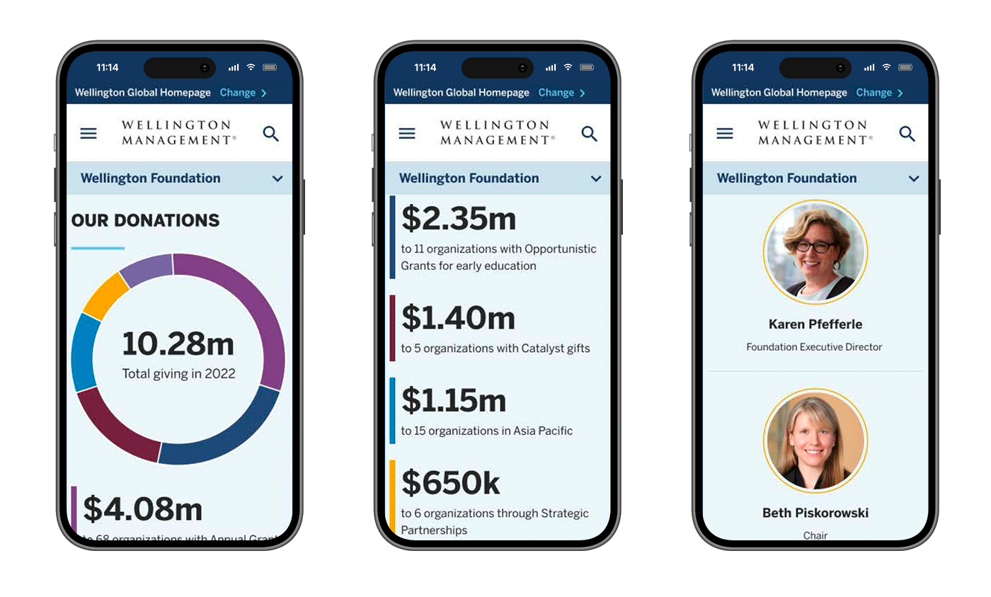
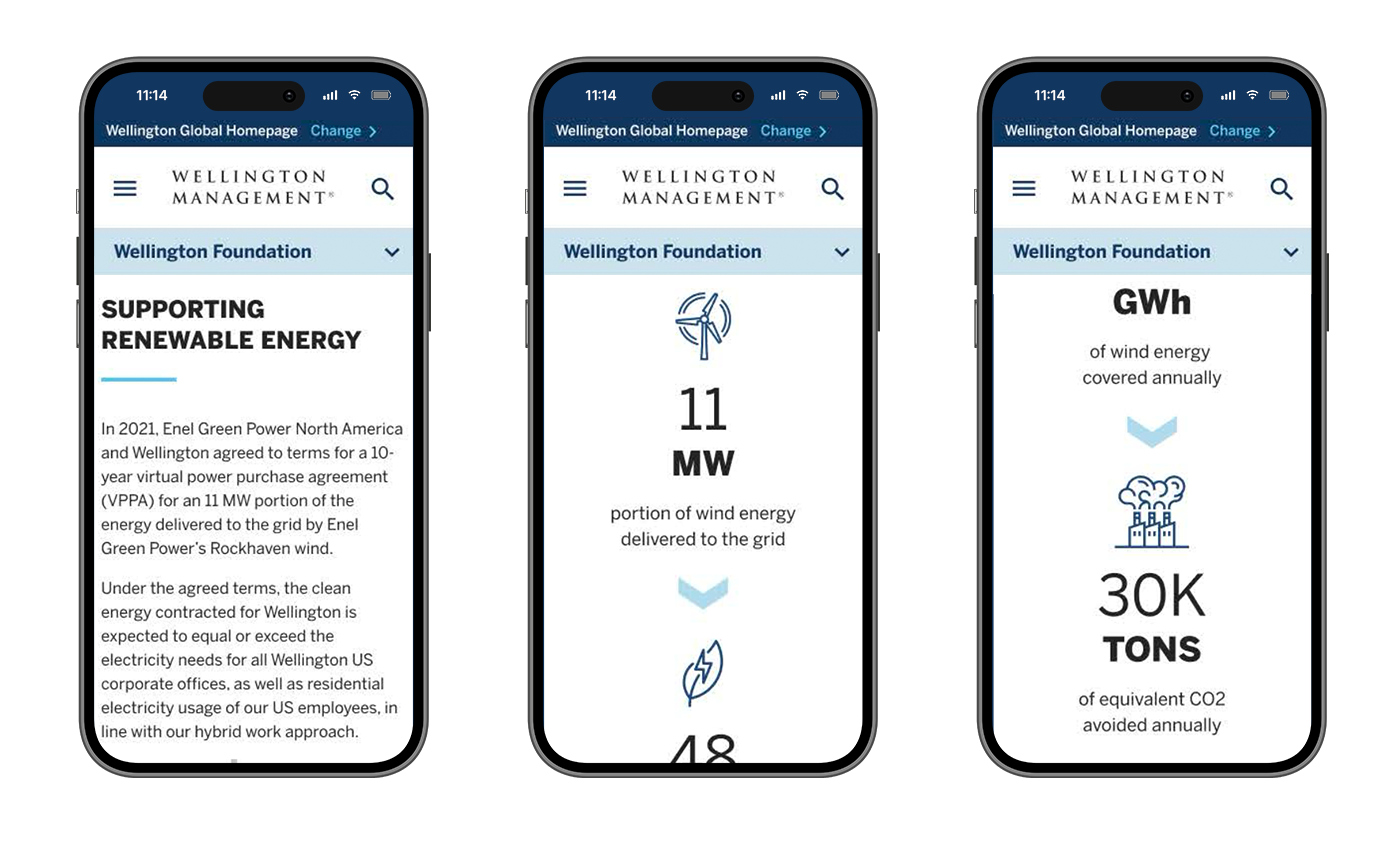
Making one of the world’s largest investment management firm’s offerings more approachable.
The Ask
Nearly 100 years old, Wellington Management is one of the world’s largest asset management firms with investment and portfolio opportunities spanning traditional equity, to private investment, to sustainable investment solutions.
Coming out of the pandemic, Wellington was beginning to stretch its arms to attract new types of investors, diversifying not only it’s investment opportunities, but also diversifying it’s investment community.
Attracting new investors was proving a challenge to the nearly 100 year old company: competitors in the space appeared more exciting, agile and modern. In an effort to appeal to these new investors Wellington aimed to update it’s marketing materials, introducing new investment categories while making their investment offerings easier to understand.
Wellington Management
Site Optimization & Design
ECD, Experience Design (SVP)
2023
The Challenge
This project had no shortage of complexity. And, while Wellington was a legacy client of Razorfish’s (going on 6 years when I joined the account), the legacy agency team had zero experience with UX and web platform projects. This was the agency’s first true platform project with the client.
My team came onboard and we stepped into discovery and learned of all the industry and client complexities:
-
Jump To
Rapidly Evolving Investment Community
Wellington was eager to attract a large swath of new investors, interested in the firm’s new investment categories — from local small businesses to sustainable investment.
Each of these investor types had their own sensitivities and sales tactics, each informed by their country’s and region’s attitudes.
Rapidly Evolving Investment Categories
With its new and upcoming investment opportunities — each offered as separate products within the firm — our team had to quickly onboard and educate ourselves on asset classes, investment categories, what could be invested together and what could not (in each region).
Complex Regulatory Atmospheres
Now, I have successfully solutioned in some inredibly regulated spaces and industries, but, each and every investment opportunity is highly regulated in each and every country/region where that opportunity is offered.
Diverse Attitudes Across the Globe
Did I mention this was a project that was going to have impacts the world over for Wellington?
We were answerable to 4 major international regions, each exclusively managed by their own team inputting their needs, concerns and reactions to the work:
- The Americas
- Europe
- Middle East
- Asia
Adobe AEM
AEM has been the de facto content management system for large organizations for the better part of 15 years — I designed within the platform way back when it was called Day CQ5.
While it is powerful, once rooted, it is not a simple platform to re-architect and re-design in (though, this is debatable, considering the managing dev/IT team).
We knew finding opportunities to “rock the boat” architecturally and visually were going to be a challenge.
Legacy Brand
Complementary to AEM as a platform, because Wellington is such an established and conservative brand, we understood that we were going to need to work within the site’s existing visual language.
The goal here was to create small initial waves with incoming designs and art, prior to proposing a massive brand and digital overhaul down the line.
UX & Information Architecture
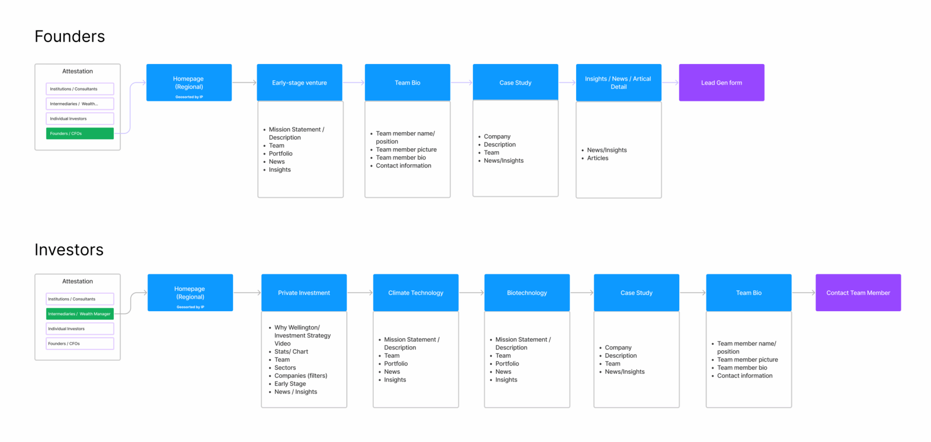
Wellington’s use cases were abundant, the firm serves both investors and company founders. Every user is required to declare themselves as one or the other as they first enter the site, a (regulatory required) step called attestation.
While informational, the ultimate goal of the website is for users — serious about engaging Wellington — to make a connection with an investment advisor via lead generation or direct contact (depending on the offering), which is handled through the user’s preferred mean of communication.
Below, you’ll find the two primary user journeys:
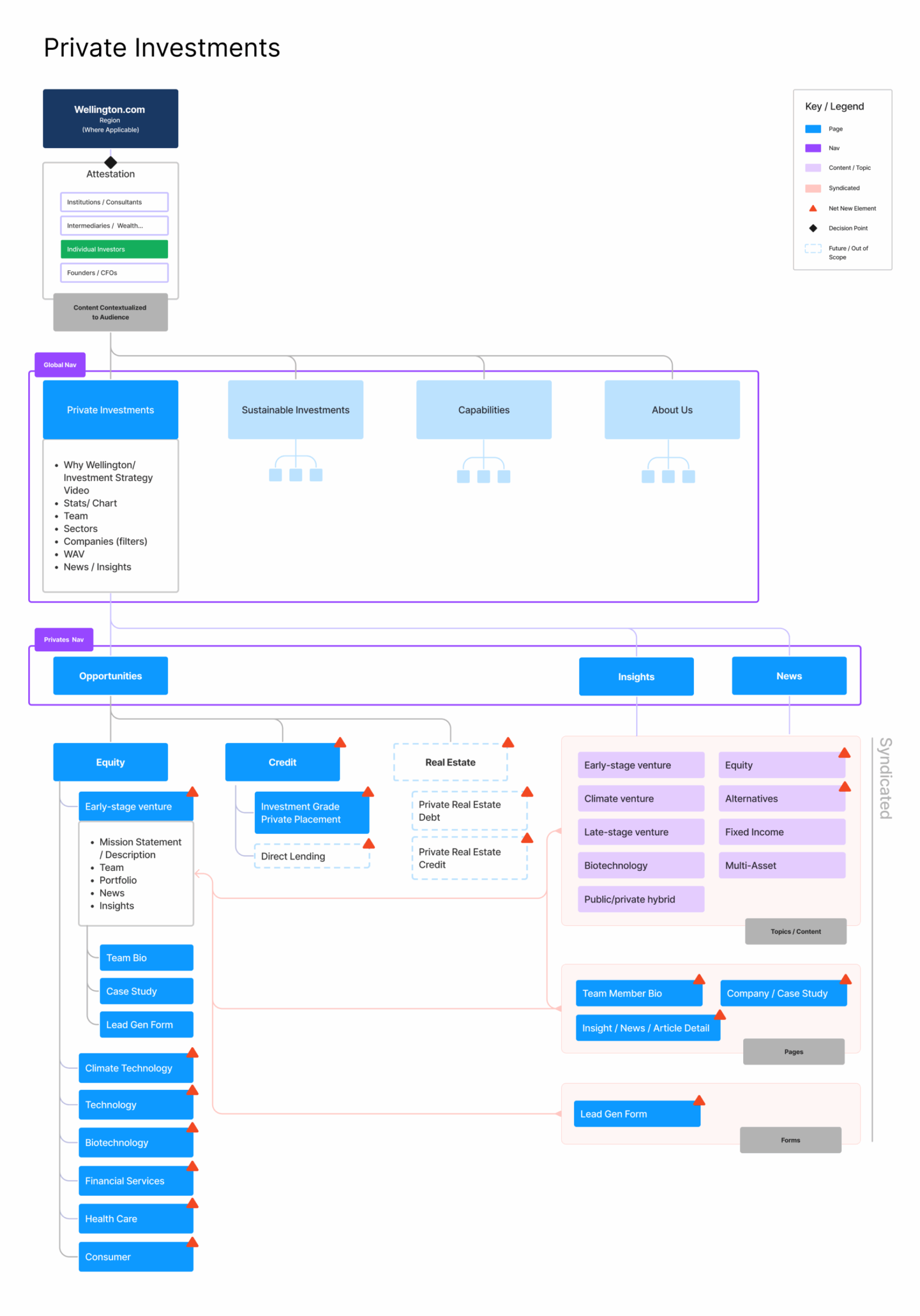
Below, you’ll find the re-architecture of Wellington’s offerings on their site, showing essentially a “sub-site” for their Private Investment options. We were able to reduce the overall site from six major sections to four.
Keep in mind, that depending on the user’s attestation (Investor or founder) and their investment region (NA, Europe, Middle East, Asia), there could potentially be up to 8 different versions of each page.
Similar Projects


