Product Strategy
Mastercard Touch Card 2
Envisioning a service enabling the visually impaired to independently facilitate their card purchase moments
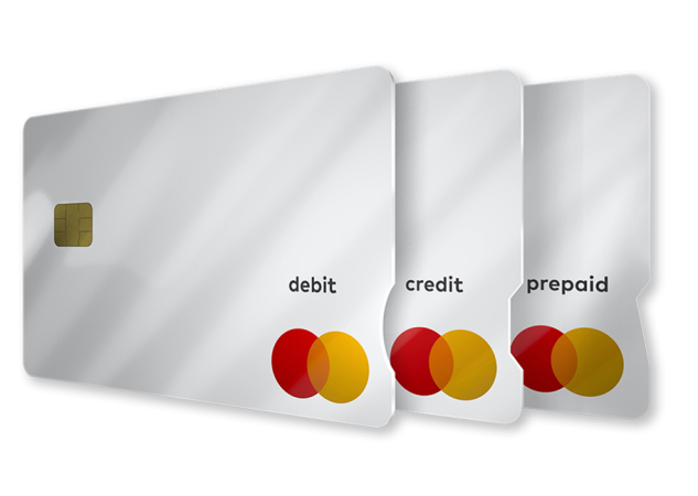
The original Mastercard Touch Card introduced tactile notches that enabled visually impaired cardholders to confidently distinguish credit, debit, and prepaid cards. Mastercard approached Razorfish to define the next evolution — a payment experience supported by technology that could offer greater independence across retail, dining, and digital checkout environments.
This project also aligned closely with my own values and ongoing accessibility work at Razorfish, where I helped establish the agency’s Accessibility Council. Having friends and colleagues with visual impairments made our research feel especially grounded — these weren’t abstract personas but real people with clear expectations for autonomy and ease.
As a result, Touch Card 2 became not just a technology exploration but an opportunity to define a payment experience that respects capability, minimizes reliance on others, and enhances everyday confidence for visually impaired shoppers.
-
Role
Experience Design Director
-
FocusUX strategy, Service Design, Ecosystem Architecture, Physical Product Design, Technology Integration
-
Duration10-weeks
Grounding Our Work
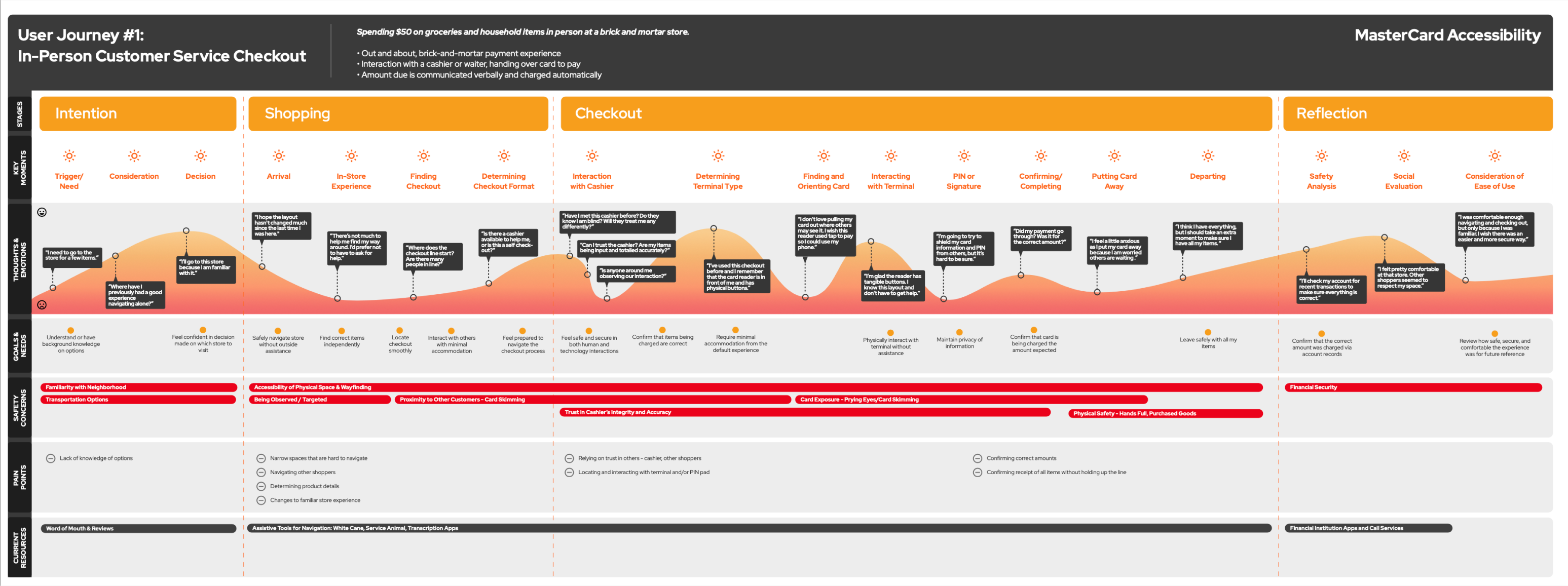
To design for true independence, we combined accessibility insights, end-user lived experiences, and partner collaboration into a single grounding foundation.
Together, these inputs defined a shared understanding of what independence truly means in a payment moment — and what barriers must be removed to enable it.
Audience Insights
- Built deep empathy for visually impaired cardholders
- Ensured we never underestimate capability or confidence
- Focused on independence, empowerment, and reward — not reduction
Accessibility Guardrails
- Extended beyond traditional digital compliance into unregulated physical/hybrid payment contexts
- Identified where standardized improvements could meaningfully unlock autonomy across varied payment systems
Technology Insights
- Identified feasible, low-energy, consumer-scale technologies
- Explored biometrics, haptics, and NFC as interoperable layers to support secure, intuitive payments
Community + Partner Collaboration
- Worked with Mastercard’s London-based team and the Royal National Institute of Blind People (RNIB) to ground concepts in real-world use
- Engaged colleagues, friends, and visually impaired individuals for feedback based on lived payment experiences
- Drew from work on the Razorfish Accessibility Council to ensure standards were met or exceeded
Key Recommendations
The program delivered a unified product and ecosystem strategy outlining how Touch Card 2 could support fully independent payment across retail, dining, and digital contexts. For users, this meant a card that not only provided tactile orientation but also worked in tandem with discreet technology layers to confirm identity, validate transactions, and guide payment interactions with clarity and confidence.
The broader ecosystem would support this experience by ensuring that merchants, devices, and digital environments could recognize and respond to the card’s capabilities. Rather than reinventing infrastructure, the strategy leveraged existing technologies and payment flows, making the solution both scalable and feasible while extending meaningful accessibility improvements across real-world contexts.

Touch Card 2: A Tech-Enabled Successor
A next-generation Touch Card enhanced with:
- Biometrics for authentication
- Haptics for confirmation
- NFC for seamless, secure interactions
All built on available, low-energy technologies already viable at scale.

Accessible Payment Ecosystem
We recommended Mastercard expand its vision beyond the card itself to encourage:
- Greater adoption through partner-enabled solutions
- Reduced risk through distributed innovation
- A more universal, accessible payment landscape

